
In this post I will bring together all the different forms of football packaging I have stumbled across.
Tim Fletcher
The Mercurial Vapour Superfly II installation at 1948 was created by Rosie Lee to be included in the Nike Stadium program. The installation placed the iconic boot at its centre with a bespoke shoebox & podium. This was surrounded by large back projections featuring animations by Danijel Zezelj and Sølve Sundsbø.
 Great use of colour, I think you'll agree a raw cardboard stock wouldn't have had the same impact as the vibrant orange against the luxurious purple. The typography just works in no uncertain terms. The weights are offset perfectly for more balance, and the portrayal of accuracy and speed are well suited to the layout.
 Further down and the poster/info sheet is less flamboyant but still holds professional qualities and carries on the use of the colour palette that shouldn't work but does.
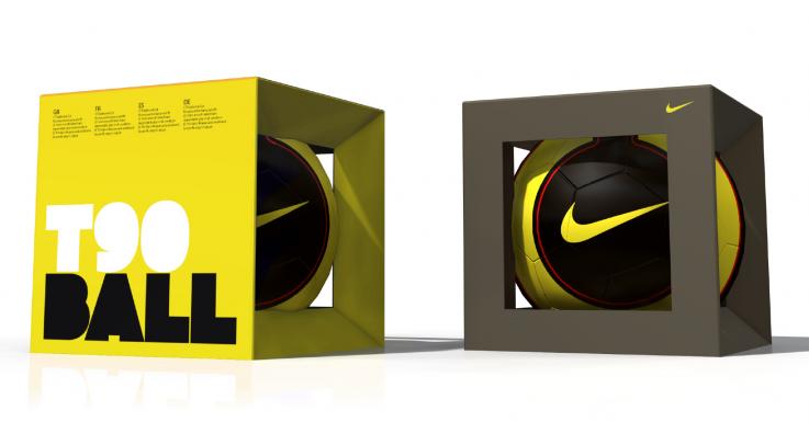
Nike Stadium Packaging
Limited number of Nike shoeboxes were transformed to house a stadium within by inserting a printed sheet of the stadium interior with embedded sound chips. So you could hear the crowd go wild when the box was opened.
 Taking a pre-existing box design and modifying it to endorse a football atmosphere. Perhaps the inside of my pack could hold some sort of imagery that runs across the dvd also.
Alvin Chan
A range of colourful packaging much in the vain of the nike superfly, lots of colour, geometric typography and gloss finishes. It isn't used to look expensive, its used to catch the eye and make money. Solid vibrant colour could be a way of drawing attention to particular sections, and I feel the use of bold typography is the way forward. I would think both my product the ones shown here would have a similar audience.


Love Creative
I had to mention the work Love have done for Umbro, which I have looked at before.
We reflected Umbro’s industrial Manchester roots, their heritage in tailoring and their love for football in this witty, highly crafted, hand-sewn and tactile packaging range for their launch into House of Fraser.
 Once again, we see a raw cardboard stock, this time offset with stickers and hand stitching. This suits the design direction which is born out of the vintage design for football of the 1950's and beyond where products were made to last and were made from solid materials. This can only have a positive effect on the outcome and sales.
The inside introduces more colour, other packing stocks which add value to the product, as though it has been cared for and packaged with thought.

This is also by Love and it is for Umbro Teamwear. This catalogue/publication carries across the design direction very well, and is supported by strong imagery. This kind of promotional material could inform the way I looked at the content for my pack.
In a world where star players hog the limelight how about a fanfare for the common man with some Umbro kit that’s tailored, smart and beautifully presented? Sunday league games have never looked better and like-for-like sales increased by 30% in the first two months.


0 comments:
Post a Comment