Identities Research

Posted: Monday 28 February 2011 | Posted by Adam Townend | Labels: , 0 comments

As part of my identities brief, I have been asked by producer Charlotte Taylor to put together a stationery set. She requires two or three different business cards which adopt a different feel but have the same identity mark.


I have covered the development of my ideas in other post but here I am looking at logotypes which are bold and simplistic. The objective of these kind of identities is to focus on what the typeface communicates through its weight, orientation, and general structure. All of the identities shown here have to bear those qualities.

Birch Studio
Birch studio created this identity and stationery for photographer Harry Watts. The font conveys his bold and methodical approach and the positioning relates to how he works. I envisage a similar look and feel for Charlotte's identity.

With the launch of the international touring exhibition 'STUDIO', Harry needed a flexible identity and an online portfolio to display his work.

The letterpressed identity represents his bold, methodical process that explores space within the three dimensional world through two dimensional images. The typography of the information mimics this by removing all excess and repeated information and leaving it on the reverse of the business card or to the side of the letterhead.

Check out his new website and see more of his work at www.harry-watts.co.uk.


Barfutura
This identity for Lazona has a similar feel to the Harry Watts identity. Once again there is no room for symbolism and extra deterrents. The use of capitals directs attention to the leading and grid structure imposed on the layout. Oddly enough, Lazona is a production company.


SocioDesign

I've blogged about this before but this identity makes use of clarendon font which has traditional and informal qualities, and looks best when used for chatty language. It looks typically English, and feels like a natural choice for the word nice. It just looks nice, which I guess was the point in the first place.

L2M3

Posted: Sunday 27 February 2011 | Posted by Adam Townend | Labels: , , 0 comments

Whilst searching for inspiration for the Giant Killer brief I came across these images of the Adidas factory outlet. L2M3 designed all manor of things including a large scale car park graphic depicting historical football moves. This design approach is similar to what I envisaged for the info graphics plotting the Jermaine Beckford goal.


This approach is simple and effective, and as much I want to get away from the cliche'd use of green paper or ink and pitch lines, I can't help but think it communicates exactly how it should. However, I can perhaps get away with using less obvious elements to illustrate the point because of the context the work sits in.

L2m3 also designed wall graphic displays and other installations all of which ran across this common theme.


Year book profile sketches

Posted: Saturday 26 February 2011 | Posted by Adam Townend | Labels: , 0 comments

Here are the initial layout sketches for the profile pages. I have a few ideas about what I want to do. These sketches will hopefully give me some direction for developing on screen.

Football Data visuals

Posted: Friday 25 February 2011 | Posted by Adam Townend | Labels: , , 0 comments


A cool example of football data visuals here. Designed by Hyperakt, it splits the tournament from groups stages to the final.


Hyperakt created this radial bracket documenting the results of the 2010 World Cup. We thought soccer-obsessed designers like us might like to have a copy of it in the form of a beautifully printed poster. The poster was printed thanks to the pledges of supporters on Kickstarter, where in one month the project received 244% funding from 230 backers! The poster has been featured on several design blogs, on the cover of the Berliner Morgenpost and it was the subject of a feature article on the New York Times official soccer blog, Goal.


Football related packaging

In this post I will bring together all the different forms of football packaging I have stumbled across.

Tim Fletcher

The Mercurial Vapour Superfly II installation at 1948 was created by Rosie Lee to be included in the Nike Stadium program. The installation placed the iconic boot at its centre with a bespoke shoebox & podium. This was surrounded by large back projections featuring animations by Danijel Zezelj and Sølve Sundsbø.

Great use of colour, I think you'll agree a raw cardboard stock wouldn't have had the same impact as the vibrant orange against the luxurious purple. The typography just works in no uncertain terms. The weights are offset perfectly for more balance, and the portrayal of accuracy and speed are well suited to the layout.


Further down and the poster/info sheet is less flamboyant but still holds professional qualities and carries on the use of the colour palette that shouldn't work but does.


Nike Stadium Packaging

Limited number of Nike shoeboxes were transformed to house a stadium within by inserting a printed sheet of the stadium interior with embedded sound chips. So you could hear the crowd go wild when the box was opened.

Taking a pre-existing box design and modifying it to endorse a football atmosphere. Perhaps the inside of my pack could hold some sort of imagery that runs across the dvd also.


Alvin Chan

A range of colourful packaging much in the vain of the nike superfly, lots of colour, geometric typography and gloss finishes. It isn't used to look expensive, its used to catch the eye and make money. Solid vibrant colour could be a way of drawing attention to particular sections, and I feel the use of bold typography is the way forward. I would think both my product the ones shown here would have a similar audience.


Love Creative
I had to mention the work Love have done for Umbro, which I have looked at before.
We reflected Umbro’s industrial Manchester roots, their heritage in tailoring and their love for football in this witty, highly crafted, hand-sewn and tactile packaging range for their launch into House of Fraser.

Once again, we see a raw cardboard stock, this time offset with stickers and hand stitching. This suits the design direction which is born out of the vintage design for football of the 1950's and beyond where products were made to last and were made from solid materials. This can only have a positive effect on the outcome and sales.

The inside introduces more colour, other packing stocks which add value to the product, as though it has been cared for and packaged with thought.


This is also by Love and it is for Umbro Teamwear. This catalogue/publication carries across the design direction very well, and is supported by strong imagery. This kind of promotional material could inform the way I looked at the content for my pack.

In a world where star players hog the limelight how about a fanfare for the common man with some Umbro kit that’s tailored, smart and beautifully presented? Sunday league games have never looked better and like-for-like sales increased by 30% in the first two months.


Umbro from LOVE. on Vimeo.

26 - Last years book

Posted: | Posted by Adam Townend | Labels: , 0 comments

I initially didn't really want to see last years book because I would subconsciously try to do something completely different to what was done before without thinking rationally. This effort is a year old now and trends have moved on. To me, I feel this feels like it was done on a tight schedule and a tight budget. The stock and finish is adequate and the photography seems fine.

The layout and font choices are not what I would choose but the subjectivity of Graphic Design means that committee will always prevail over ones choice. I am unsure as to how much effect the client had on the look of this book or the deadlines that were worked too but I feel we can go a step beyond with the book this year. There is a certain layout throughout the book that makes the spreads repetitive. I felt that once I'd seen a few of the spreads I had seen them all. That said, the quotes spreads break up the cycle which is something we may implement in our book dependent on the content provided.

The book has a minimal colour palette which is a good decision based on the amount of colour used in the imagery. Although, perhaps the whole book could be lifted by one colour, not necessarily a spot colour as this would add to the expense needlessly. I am still confused about what Interdisciplinary want to get out of the year book, and I feel this could have been a stumbling block last year. We must get to the bottom of what they want the year book to be; a celebration of the students and their work to promote the course or as a promotional book for the degree show. It looks like they have tried to do both here.


Market Value

Posted: | Posted by Adam Townend | Labels: , 0 comments

I order to illustrate the difference between the teams on the day, I propose to use the market values of each player on each team on the teamsheets. It is staggering the amount of money spent on Manchester's strike force alone. They believed that they would be resounding winners on the day due to their potent strike force of Wayne Rooney and Dimitar Berbatov.

Tomasz Kuszczak £4,000,000 (West Bromich Albion)
Gary Neville £0
Wes Brown £0
Jonny Evans £0
Rafael Da Silva £2,700,000 (Fluminese)
Anderson £14,000,000 (Porto)
Darron Gibson £0
Danny Welbeck £0
Gabriel Obertan £3,000,000 (FC Girondins Bordeaux)
Wayne Rooney £27,000,000 (Everton)
Dimitar Berbatov £30,750,000 (Tottenham Hotspur)

£81,450,000

Kasper Ankergren £500,000 (Brondby)
Jason Crowe £0 (Free Agent)
Patrick Kisnorbo £0 (Free Agent)
Richard Naylor £0 (Ipswich Town)
Andrew Hughes £440,000 (Norwich City)
Michael Doyle £0 (Loan from Coventry City)
Neil Kilkenny £198,000 (Birmingham City)
Bradley Johnson £250,000 (Northampton)
Jonny Howson £0
Luciano Becchio £0 (Free Agent)
Jermaine Beckford £45,000 (Wealdstone)

£1,433,000

A bit of packaging

Posted: | Posted by Adam Townend | Labels: , 0 comments

I want to create a pack which includes a number of elements for the Giant Killer brief. Although it isn't my focus, typography is so I will be looking at ways to construct a pack and also pay attention to laying out typography as a main focus. I like the idea of using raw stocks such as this when used for a reason. I am unsure if it would suit the brief I am undertaking as I made the decision that it should be luxurious and memorable. This was designed by Rajmund Rajchel.


Paper facts: cardboard, Black board, Kraft 140 g/m2, Super Snowbright creamy 90g/m2 Size: Grand box - 265x265mm, small pack - 150x150mm

Print techniques: one-color offset litho, line screen 200dpi

Additional techniques: debossed cover, die-cutting, laser cutting

Gastrotypographicalassemblage

Posted: Thursday 24 February 2011 | Posted by Adam Townend | Labels: , 0 comments

This was a exhibition visit I wanted to do, but I missed it. It closed in October, but you get the idea from this video.

Kemistry Gallery in London has been exhibiting the work of legendary designer Lou Dorfsman, art director for CBS network. The exhibition centers on his most notable creation, the 11 meter wide handmade wooden typographic wall that he named Gastrotypographicalassemblage. With custom type created by Herb Lubalin and Tom Carnase, the wall contains almost 1500 individual characters.


Gastrotypographicalassemblage from christian carlsson on Vimeo.

Font variations

Posted: | Posted by Adam Townend | Labels: , 0 comments

I've dropped in some font variations to the give the client some samples to choose from. I feel that this layout is my best effort, so myself and Dan will present the ideas we had at the next meeting.

After the meeting we will know what we have to run with or change around, and that will mean a big obstacle is out of the way. We still need to work on a colour palette but I would advise against a large amount of colour usage if the images are as saturated as the ones seen here.

The fonts I have used include serif, sans serif and slab serifs. Notably 'Rockwell' which is working well for the title and pull out quotes. Other fonts include, Gothic 725, Helvetica Neue, Gill Sans, Baskerville, Franklin Gothic, etc.

Second Duffield Quote

Posted: Wednesday 23 February 2011 | Posted by Adam Townend | Labels: , 0 comments

This is another quote from Duffields printers for the same book printed on a standard silk. This gives me an idea of how much more it is to print on the regency stock.

so we are talking around £400 more for the stock we want.

For the regency satin it would cost £4.17 per copy
For the standard satin it would cost £3.17 per copy

Update for next meeting

Posted: | Posted by Adam Townend | Labels: , 0 comments

Myself and Dan have made some good progress with what we have to work with this week.

We both compiled a list of the things we've done in preparation and what we need to do by next week.

- Layout variations (done some, could do some more if we have time.)
- Print quotes (I got a basic quote from Duffields but this may have to be revised once we get a definite number of pages)
- Woodwork quote (done, works out around £150 for the wood)
- Mock ups (paper mock ups showing potential avenues for folds and pull outs)
- Order more stock samples (I've made inquiries into Robert Horne but still waiting for stock)
- Imagery, words, contact (speak to client about maximum number of words and images per spread)
- Font suggestions (Take a note of all the font combinations that have been used and present to client)
- Organise regular meetings (This is vital to the development of the project and needs to be sorted around my work placement)
- Deadlines (We must make them aware of our deadlines and impose some to make sure we are hitting ours).

It is essential we have this list completed and arrive prepared for the meeting so that not only we look professional but they see us as designers not students pretending to be designers.

More Year Book spreads

Posted: | Posted by Adam Townend | Labels: , 0 comments

Been working on the Spreads again this morning, and I am liking the way they are coming together. The 12 column grid is makes moving content around easy, and I've shown it's flexibility through displaying different images in a range of sizes. The important thing to show the client is that this grid system can hold all matter of content and hold down a structure.

For Print Only

Posted: | Posted by Adam Townend | Labels: , 0 comments


Another great resource here, which I found last year but have never made use of it. Gives details on stock, print run, and costings for print jobs. A step closer to finding the stocks one needs.

Fonts in Use

Posted: | Posted by Adam Townend | Labels: 0 comments


Stolen shamelessly from Ian's blog, I think this could be a really useful resource and a time saver when it comes to tireless research once the database of work grows. It would be nice for more studios to release details on font usage when they post work, as they know the only people really interested in their websites are other designers.

Check it out

Outclassed. Outscored. Outsung.

Posted: Tuesday 22 February 2011 | Posted by Adam Townend | Labels: , 0 comments

Brilliant quote that will undoubtedly make up some of the content

Outclassed. Outscored. Outsung.

Three simple words said it all at Old Trafford today, as League One leaders Leeds United produced one of the greatest FA Cup shocks in years dumping fierce rivals Manchester United out of the prestigious competition. 9000 travelling fans roared Leeds onto a famous victory thanks to a Jermaine Beckford goal on 19 minutes.

Interdisciplinary year book layouts

Posted: | Posted by Adam Townend | Labels: , 0 comments

Development using the type and images from last year. the latter ones are starting to take shape. We will present a selection of ideas at the next meeting. Dan is also doing some layout variations which are far removed from these, which is a good thing, as the client can choose between each direction.


Leeds United vs Manchester United

Posted: Monday 21 February 2011 | Posted by Adam Townend | Labels: , 0 comments


This post will contain design associated with the FA Cup game I am focusing on for this brief.


Match Report

Jermaine Beckford used to patrol the roads for the RAC, assisting the stranded, but yesterday, amid tumultuous scenes, he took great pride in engineering a breakdown.

Manchester United will recover — they always do — but Beckford’s decisive strike left them looking an emotional wreck. Not even the usually reliable home-start service offered by Wayne Rooney could rescue them on the road to Wembley. In slumping to their most humiliating day in the FA Cup since falling to Bournemouth 26 years ago, Manchester United felt particularly enraged by the identity of their conquerors. Usually only Leeds Rhinos prevail here.

Not since Brian Flynn struck in 1981 had the side from Elland Road enjoyed victory at Old Trafford. Familiar faces from Leeds past gathered to witness this famous moment. Eddie Gray, Peter Lorimer, Howard Wilkinson and Flynn himself all watched enthralled as Simon Grayson’s men summoned up the spirit of fabled days gone by. This was no flukey win, no ground-out 1-0. This was a deserved triumph rooted in the supreme effort of a tight-knit bunch of players responding to a popular manager’s tactical commands and exhortations.

Grayson’s players kept passing and pressing. Even when the cramp bit deep into their legs, when the lactic acid threatened to flood their engines, Leeds held firm, making a mockery of the 43-place gulf and the financial divide. Manchester United could buy back EllandRoad and their Thorp Arch training ground with the £18 million Sir Alex Ferguson lavished on Anderson.

Even when the fourth official, Stuart Atwell, signalled five additional minutes, prompting 9,000 Yorkshire voices to chant “Fergie Time’’, Patrick Kisnorbo kept blocking and Casper Ankergren kept saving.


Leeds have suffered so much over the past decade, what was another five minutes’ pain? When referee Chris Foy at last decided enough was enough, the final whistle can rarely have sounded sweeter for Leeds.

As so often in defeat, particularly when his players have so obviously underperformed, Ferguson employed diversionary tactics, railing about a shortage of injury-time which had actually seemed excessive. Most observers were predicting four minutes – 30 seconds each for the five subs, a minute for the physio attending Luciano Becchio and 30 seconds for a skirmish to subside.

If anything, Ferguson should have been grateful to Foy, who could easily have dismissed Wes Brown. After late challenges on Becchio, Bradley Johnson, Michael Doyle and Beckford, it was a miracle to find the England centre-half still on the field by the end, but then this was a day for shocks.

As Foy blew for full-time, some of Grayson’s players fell to the floor in exhaustion, having given everything. Others calmly shook Rooney’s hand, even Gary Neville’s. Doyle then led the charge towards Leeds’ jubilant support, a hugging, high-fiving, texting throng. Yesterday was rich reward for fans who have faced the Four Horsemen of the Apocalypse: relegation, administration, points deduction and Dennis Wise.

The intense loyalty of Leeds’ followers, many of whom paid £51 a ticket for this date with destiny, is one of the most eye-catching and uplifting features of the modern game. Here was a reminder that clubs will never die as long as the lifeblood, the support, stays strong. So how fitting it was that passionate Leeds fans orchestrated victory: Grayson, coaxing from the edge of his dugout; Richard Naylor, organising the defence; and Jonny Howson, whose stunning 50-yard pass created the decisive goal. In an era when some clubs lose their roots and their soul, Leeds are driven on by those with the club in their hearts.
Yorkshiremen like Grayson, Naylor and Howson knew what this fixture meant to their supporters. Gabriel Obertan, Dimitar Berbatov and Anderson seemed not to understand its significance despite the beseeching of the Stretford End. As if the odd scrap outside had not reminded everyone of long-standing enmity, the home hordes unveiled a banner designed to antagonise the visitors. Alongside a picture of Eric Cantona, who defected from Elland Road in 1992, were the words “Thanks A Million’’. Within 15 seconds of Foy’s opening blast the air rang with chants of “Cantona’’.

Their voices were soon drowned out. The Leeds 9,000 never stopped singing, their hymns of defiance growing in volume and substance as Grayson’s side took a grip of midfield and never let go. Howson angled passes in from the right. Doyle and Neil Kilkenny, all energy and simple passes, bossed Anderson and Darron Gibson in the centre.

Johnson, brimming with inventive running down the left, exposed Neville’s lack of pace. How Ferguson’s side missed the combativeness of Darren Fletcher, rested in readiness for Carling Cup duty against Manchester City on Wednesday.

Having built a platform, Leeds began to perform, taking the lead after 18 minutes. The move began when Naylor nicked the ball off the over-elaborating Berbatov. Howson took over, immediately looking up and spotting the ragged state of Ferguson’s backline.

Launching a superb delivery, Howson invited Beckford to run at goal, to bury the jibes of being a flat-track bully who disappears on the big occasions. Beckford has featured in big games before, in tense play-offs and a Carling Cup tie against Liverpool, and never shone. He did now.

Yet even if he leaps through the transfer window to Newcastle United, Beckford will always be remembered fondly at Elland Road. Racing away from Brown, Beckford appeared to have dragged the ball too far wide with a heavy first touch. This actually served the accidental purpose of luring Tomasz Kuszczak from his line. As the keeper ran towards Beckford, the striker stroked the ball back across Kuszczak and in. The ball seemed to take an age to cross the line, as if slightly disbelieving of its role in making history.

As it finally rested in the net, Leeds celebrated wildly yet they knew how much work remained. Rooney was never going to take the prospect of defeat lightly. Leeds’ defence was put to the test — but never the sword and Jason Crowe somehow cleared a Rooney shot off the line. Manchester United began to get rattled, their frustration spilling over when Brown clattered Becchio and then Johnson. Neville shouted some pithy words at Grayson. The second half opened with an awful lunge by Brown at Doyle. Leeds gave as good as they got. Naylor was cautioned for sending Rooney flying.

So often Ferguson’s saviour this season, Rooney needed help so the manager sent on Ryan Giggs and Antonio Valencia and then Michael Owen. Leeds’ defence still repelled all incoming threat. Kisnorbo headed out a shot from Gibson, Ankergren saved from Rooney and then Fabio.

Ferguson’s men were guilty of some bad misses, Rooney shooting over and Owen heading wide. Amid intermittent pressure, Leeds could easily have added to the score line through substitute Robert Snodgrass, who hit a post, yet one was enough. Beckford the old breakdown man had left Manchester United with a hard shoulder to cry on.

Magpie Studio

Posted: | Posted by Adam Townend | Labels: , 0 comments

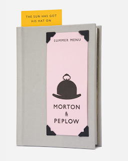
This identity for Morton & Peplow is simplistic in form yet immediately eye catching, due to the attention to detail, stock and use of colour. The strength of the identity and iconography is reinforced by its implementation across a range of media. The way the hat is incorporated into the tips jar is clever.


Morton & Peplow is a Munich delicatessen that specialises in British cuisine. Our identity combines two icons of Britishness - the bowler hat and the domed silver service platter - to create a mark that evokes a sense of heritage and style.


SVIDesign

Posted: | Posted by Adam Townend | Labels: 0 comments

Simplistic identity for Victoria Beckham fashion line. This is a no fuss identity which can work seemlessly across print and web matter. I like the idea of taking the materials involved with the products and finding matching pantones. I really need to consider the deliverables for my identities brief, and make them reflect the practice more.


Treble 7

Design Agency Treble 7 released these limited edition prints for both the World Cup and Premier League to raise money for SoccerAid & Unicef. Nice use of typography and particularly on the premier league one. It feels like it relates to both traditional football graphic design and the typographic driven swiss era that interests me greatly.