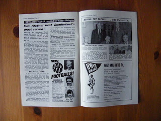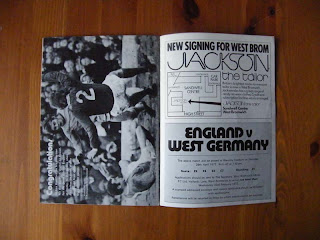
Some of the layout makes no allowance for gutters, margins, or hierarchy and I think that is both positive and negative. The people designing these would have been working to time constraints and budgets. So leading and kerning is the last thing they would have thought about.
Millwall
Huddersfield
West Brom
Giant Killer visual research
Posted:
Tuesday, 1 February 2011 |
Posted by
Adam Townend
|
Labels:
Brief 5 - Giant Killers,
OUGD303DC
Subscribe to:
Post Comments (Atom)
Labels
- Action plans
- Brief 1 - Flatland
- Brief 2 - Identities
- Brief 3 - Garry Barker
- Brief 4 - Interdisciplinary Year Book
- Brief 5 - Giant Killers
- Brief 6 - Decades
- Brief 7 - Leeds Loves Creativity
- Brief 8 - Design Context Publication
- Brief 9 - Year Book Pitch
- OUGD303DC
- OUGD303DP
- Statement
- bibliography
- briefs
- evaluation
- feedback
- tutorial
Other Blogs
Archive
-
▼
2011
(307)
-
▼
February
(72)
- Identities Research
- L2M3
- Year book profile sketches
- Football Data visuals
- Football related packaging
- 26 - Last years book
- Market Value
- A bit of packaging
- Gastrotypographicalassemblage
- Font variations
- Second Duffield Quote
- Update for next meeting
- More Year Book spreads
- For Print Only
- Fonts in Use
- Outclassed. Outscored. Outsung.
- Interdisciplinary year book layouts
- Leeds United vs Manchester United
- Magpie Studio
- SVIDesign
- Treble 7
- Jeni Sargeant - first draft finals
- Bibliography
- Year Book quote
- Chat w/ Joe
- Year Book Meeting
- Football Information graphics
- typographic installation
- Flatland
- Stock for Flatland
- Wood workshop - budgeting
- Year Book eureka moment
- Interdisciplinary Year Book meeting 1
- Letterhead & comp slip tests
- Identity foil block tests
- Jennifer Sargeant business cards
- Action Plan
- Identity development - phase three
- Identity development - phase two
- Initial ideas and phase 1 development
- Jennifer Sargeant - identity
- Giant Killers - Brainstorm
- Design context workshop
- Giant Killer - Content research
- Garry Barker boards
- Essays & Etching advertising
- Barker Vernon Street variations
- Design Inspiration
- Make
- McSweeneys
- Garry Barker development
- Nicole Coates - Meeting to discuss brief
- Jennifer Sargeant - Meeting to discuss brief
- Year Book Pitch Boards
- Book photography
- Layout variations
- Garry Barker final template
- Linking elements
- Mock template
- Cardboard mockup
- Garry Barker Package front
- Garry Barker fonts
- Garry Barker - paper engineering
- Footprinters
- Year Book covers
- Garry Barker Publication
- Year Book
- Flatland: making the book work
- Action Plan
- Giant Killer visual research
- Action Plan
- Giant Killer brief - initial ideas/ analysis
-
▼
February
(72)


0 comments:
Post a Comment