Browns
Minimal copy, allows stock to bring attention. Really tactile feel.
Mash C reative
Printed using phosphorescent ink, this ties in with our idea perfectly.
 Dale magazine
From the Behance network. Shows good use of overprinting type and image. Unsure how this would work when presenting work but may be able to be exercised on pages with quotes and images.

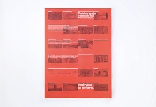
 Património no território is the title of the next example by we work for knowledge. Particularly like the duotone image and text. Works well and could be achieved in the opening sections of the year book.
 Finally this example designed by Ramon Lenherr caught my attention due to the stock. It looks like a pale pink, ultra thin uncoated stock which would could be used as an offset to the premium weight paper we could use for the work. The opening sections could make use of this stock to layout any copy and quotes.
 Ashwin Patel.. Luke mentioned an idea similar to this.
Year Book - Moodboard
Posted:
Thursday, 27 January 2011 |
Posted by
Adam Townend
|
Labels:
Brief 9 - Year Book Pitch,
OUGD303DP
Subscribe to:
Post Comments (Atom)
Labels
- Action plans
- Brief 1 - Flatland
- Brief 2 - Identities
- Brief 3 - Garry Barker
- Brief 4 - Interdisciplinary Year Book
- Brief 5 - Giant Killers
- Brief 6 - Decades
- Brief 7 - Leeds Loves Creativity
- Brief 8 - Design Context Publication
- Brief 9 - Year Book Pitch
- OUGD303DC
- OUGD303DP
- Statement
- bibliography
- briefs
- evaluation
- feedback
- tutorial
Other Blogs
Archive
-
▼
2011
(307)
-
▼
January
(38)
- Statement of Intent - Updated
- Tutorial with Fred
- Magdalena Czarnecki
- Xavier Encinas
- Nelson Associations
- Briefs
- Flatland book ideas
- Live brief meetings
- Year Book - Moodboard
- Flatland Chapters
- Chat with Joe
- Flatland mock up covers
- Flatland full scale mock up prints
- Flatland final mock ups
- Flatland ideas
- Flatland typefaces
- Group Tutorial w/ Lorenzo
- Flatland Mock ups
- MadebySix
- Two more briefs
- Chevychase
- Roses student awards
- Flatland chap books mockups
- Possible Collaborations/ new briefs
- Fubiz Network
- Gidi Vigo
- Another brief
- Statement of Intent form - first draft
- Updated Triangulated focus statements
- Spin
- Hunt
- Patrick Fry
- Studio Newwork
- The International Office
- ISTD - Flatland initial ideas
- Analysis of briefs
- Selected briefs - ISTD & D&AD
- Design Strategy workshop
-
▼
January
(38)

0 comments:
Post a Comment