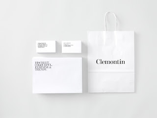
 Clemontin Jewellery stationary and packaging. Minimalist typographical driven design, with clean, crisp and focussed range.
The range stems from simplistic logotype. Lovely use of negative space and intense type work. This approach really allows the typeface to work without the distraction of imagery or illustration.
I feel this relates to my practice and focus for the year. I also think this kind of approach could work the fashion designers brief I could be doing.


0 comments:
Post a Comment