Few little changes were made to this. This is still a starting point and it will be evaluated against regularly.
Tutorial with Fred
I had a tutorial with Fred on friday, and all went as well as it could have. We went through my statement of intent picking out reference points which could inform my design context. Football, and info graphics seem to be the key to a good starting point. This would then open out to include new lines of research into how info graphics could be presented and then perhaps the production involved in experimenting with finishes and such. I have recently been looking at the format of a book and paper folding, which I know nothing about in truth. However, this could be a big opportunity to learn more about the subject, not just to inform one brief, but that could filter into others.
Fred commented that I was production focused and always my work always had a professional aesthetic as though it could be out there if I thought about the context a little more. This is something I really want to hit on in this module, and make sure my approach consists of more than sticking a logo on an iphone, a mug or a banner.
We discussed the briefs I had going at the minute, and he was happy with what briefs I had chosen but urged me to start on the Giant Killers brief as this brief was mine and I could do what I wanted with it. The other briefs should then run along side this.
Notes from the tutorial
- Challenge what profession expects
- Take risks to shape outcome
- Paper folding (Leeds History and recent downfall) Contextual research?
- Beauty of diagrams
- Start to develop contextual evidence
- Publication should map my practice (This book sums up my practice and interests)
Magdalena Czarnecki
Xavier Encinas
Nelson Associations
Briefs
3 of the briefs that I intend to respond to. I feel that these briefs relate to my design practice and my interest in typography and layout will be suited to all three of them. Of course, the briefs here relate to differing outcomes, but all resolutions will have a focus on my interests.
Brief 2
Brief 3
Brief 5
Flatland book ideas
 These are the ideas for the cover of the book. I have decided I wanted to base the design around some sort of repetitive pattern, and have the type on their to compliment it.
Live brief meetings
In the attempt to get going with this live brief, designing 5 identities for 5 different students, I made a last attempt to round up the initial interest I had and work out a meeting to discuss the potential brand the clients want to build. Both Jennifer and Nicole arranged to have meetings with me yesterday to discuss initial ideas for the project.
I intend for this brief to run for longer than I expected, as each client has differing expectations and deadlines. I now have 2 out of the 4-5 identities I want to design with another 2-3 people showing interest.
I took some notes down from each meeting which I will scan and post here later.
Year Book - Moodboard

Browns
Minimal copy, allows stock to bring attention. Really tactile feel.
Mash C reative
Printed using phosphorescent ink, this ties in with our idea perfectly.
 Dale magazine
From the Behance network. Shows good use of overprinting type and image. Unsure how this would work when presenting work but may be able to be exercised on pages with quotes and images.

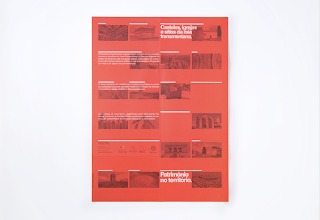
 Património no território is the title of the next example by we work for knowledge. Particularly like the duotone image and text. Works well and could be achieved in the opening sections of the year book.
 Finally this example designed by Ramon Lenherr caught my attention due to the stock. It looks like a pale pink, ultra thin uncoated stock which would could be used as an offset to the premium weight paper we could use for the work. The opening sections could make use of this stock to layout any copy and quotes.
 Ashwin Patel.. Luke mentioned an idea similar to this.
Flatland Chapters
I have mocked up every chapter in the book, and the content differs hugely from one chapter to the other. Joe said he didn't think it detracted from the format I had so I'll go with it, but some of the content was hard to fit in the current format.
Chapter 1
Chapter 2
Chapter 3
Chapter 4
Chapter 5
Chapter 6
Chapter 7
Chapter 8
Chapter 9
Chapter 10
Chapter 11
Chapter 12
Chapter 13
Chapter 14
Chapter 15
Chapter 16
Chapter 17
Chapter 18
Chapter 19
Chapter 20
Chapter 21
Chapter 22
Chat with Joe
Another good chat with Joe about my Flatland brief. I have got towards the end of the brief now, and showed him my ideas for the folding chap books, and he really liked it, but there is still some uncertainty of how it relates back to the book.
Flatland mock up covers
I'm unsure how these will exist within what I am proposing at the moment, but I found some old graph paper whilst searching for my pens, and liked the idea of using graph paper templates as a pattern for a front cover. The graph texture comes in when discussing the illustrations in the book.
I've tried it out with various graph textures and I will get some opinions from people once I figure I am going to do.


These layouts seem to fit better than the ones that bleed off the page.


Flatland full scale mock up prints
The prints came out quite well on the paper I selected. Although, unexplainably the content has shifted somewhat so the margins and gutters don't tally up. This a minor thing that I will put right. Somehow the paper has shifted when printing. It's annoying, but I'll have to factor in some sort of contingency plan if it messes up again.


Flatland final mock ups
I've successfully created 3 of the chap books, and hopefully, will be printing them this afternoon. It's important choose a stock that can be folded easily and is relative similar to that of a book.
Flatland ideas
 Whilst working on potential various for book covers for the Flatland brief, I decided to look more at how the packaging might be. The 2 sections of the book would be positioned in the box as so with a band around each. The box lid with then have the book cover on.

I also started to look at making a flatland mark, or logo. I didn't want any sort of icon or anything to accompany the type, and I plan to try different typefaces to see what would fit.
Flatland typefaces
I have been looking at lots of different typefaces for the flatland brief. I intend on printing these to look into the legibility and readability of them for the content, as I really need a typeface that is clear and clinical, as this is the focus within the brief.
Group Tutorial w/ Lorenzo
First tutorial of the module kicked off with a discussion with Lorenzo about the clarity of what we wanted to deliver during the module, and how the statement of intent and the briefs we select should correspond to make a water tight submission with an informed approach.
Flatland Mock ups
MadebySix

Two more briefs
I have chosen to get involved in the Gary Barker publication brief and the Year Book briefs and I have posted them here to give a better understanding of what the briefs are about.
Chevychase
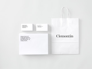
 Clemontin Jewellery stationary and packaging. Minimalist typographical driven design, with clean, crisp and focussed range.
Roses student awards
Found this very small and open brief based on money in football. This could inspire me to respond to this with my own brief.
Brief 3. “Unbelievable Jeff!”
Money has completely changed football to an unrecognisable level. The game, the clubs, the players have all been distorted and removed from the fans and the communities in which they’re based. Your challenge— using any appropriate media—is to bridge the gap between a football club and its fans in an engaging, rewarding, and inspirational way that
makes them proud to be a supporter.
link to all briefs
http://www.thedrum.co.uk/pub/global/file/pdf/studentroses.pdf
Flatland chap books mockups
Started to mock up these chap books. I've run into problems because the content in each chapter obviously varies. It's really annoying because some pages are blank, however, I'm unsure of how I can change it for the better.
Possible Collaborations/ new briefs
Earlier today I sent out an email to the other 3rd years on different courses including, fashion, printed textiles, and photography. I immediately had some interest and had a meeting this afternoon with one of the fashion students.
Fubiz Network
Labels
- Action plans
- Brief 1 - Flatland
- Brief 2 - Identities
- Brief 3 - Garry Barker
- Brief 4 - Interdisciplinary Year Book
- Brief 5 - Giant Killers
- Brief 6 - Decades
- Brief 7 - Leeds Loves Creativity
- Brief 8 - Design Context Publication
- Brief 9 - Year Book Pitch
- OUGD303DC
- OUGD303DP
- Statement
- bibliography
- briefs
- evaluation
- feedback
- tutorial
Other Blogs
Archive
-
▼
2011
(307)
-
▼
January
(38)
- Statement of Intent - Updated
- Tutorial with Fred
- Magdalena Czarnecki
- Xavier Encinas
- Nelson Associations
- Briefs
- Flatland book ideas
- Live brief meetings
- Year Book - Moodboard
- Flatland Chapters
- Chat with Joe
- Flatland mock up covers
- Flatland full scale mock up prints
- Flatland final mock ups
- Flatland ideas
- Flatland typefaces
- Group Tutorial w/ Lorenzo
- Flatland Mock ups
- MadebySix
- Two more briefs
- Chevychase
- Roses student awards
- Flatland chap books mockups
- Possible Collaborations/ new briefs
- Fubiz Network
- Gidi Vigo
- Another brief
- Statement of Intent form - first draft
- Updated Triangulated focus statements
- Spin
- Hunt
- Patrick Fry
- Studio Newwork
- The International Office
- ISTD - Flatland initial ideas
- Analysis of briefs
- Selected briefs - ISTD & D&AD
- Design Strategy workshop
-
▼
January
(38)


