
 I printed this type on the grid so I could make adjustments to the type. The example isn't very good but it shows how I will develop the final logotype.
Collie Co adjustments
Posted:
Wednesday, 6 April 2011 |
Posted by
Adam Townend
|
Labels:
Brief 2 - Identities,
OUGD303DP
0
comments
Studio Brave
Posted:
Tuesday, 5 April 2011 |
Posted by
Adam Townend
|
Labels:
Brief 8 - Design Context Publication,
OUGD303DC
0
comments
 Australian based design studio who have become my new favourite studio. Their publishing stuff is really impressive, and inspires me to try to think beyond the conventional. This particular publication was designed for Metropolis Inc who are property developers. This bespoke publication really gives a sense of the quality of the work their client does. The Type and layout isn't particularly breathtaking but the attention to detail and use of print finishes and appropriate binding and stocks takes the publication to another level.


In an unrelated project this is an example of content working across stationery, poster/flyers and magazine layouts. Again the stock, and colours really lift the piece. The use of the orange on black is rather effective.
St Kilda Film Festival 2010 – Campaign Identity
Over 3 years we have built up the St Kilda Film Festival brand and elevated its positioning and exposure. It’s now Australia’s premier short film festival. In 2010 our hero was a dark and moody creature of the night. The cheeky bat embodies a touch of film genre. Other nocturnal creatures cameo throughout the campaign collateral.


Logo emblems
 I've seen a lot of logo emblems cropping up on my blog roll. I think something like the examples shown could work for Nicole's identity.
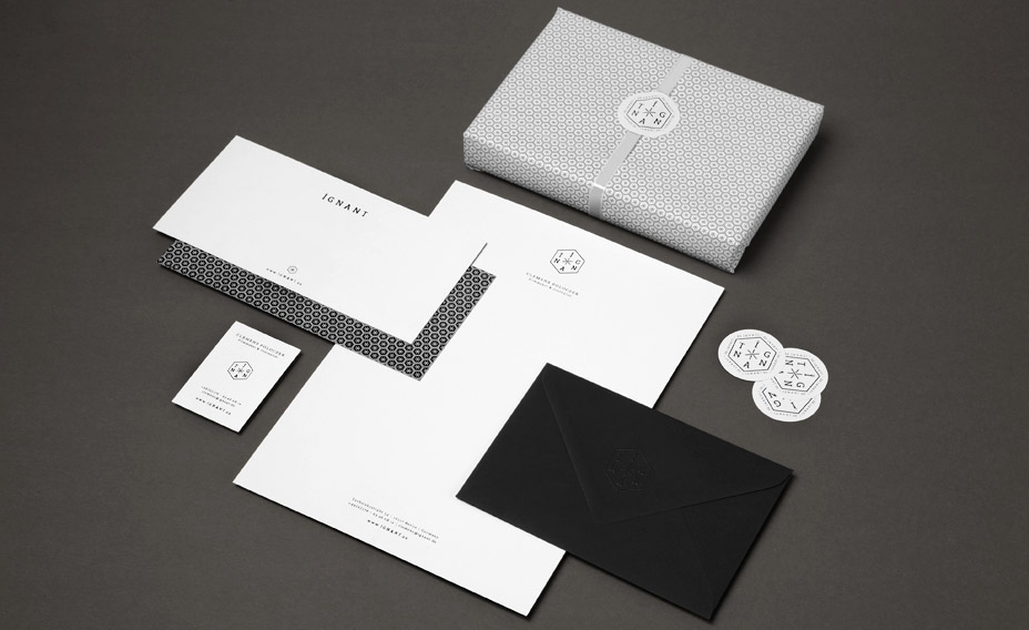


Manual
 I think I blogged about Manual during the last year. I can't be sure but here it is again if I did. This particular piece of work is very relevant to the identities brief I am looking at now. With two identities done I believe it is time to refocus and start to bring in much more research at this point, otherwise I am going to come up with generic results when I try to design.
The identity I am looking at for the time being is for Nicole Coates, another fashion designer who works with industrial and mechanical objects as the inspiration for her clothing line. Nicole had ideas about what she wanted, but I wanted to portray her approach in more than just type and image choice, but look at ways to get the look she was after by selecting appropriate paper stock and processes.
The example shown here by Manual is a stationery set for photographer & director Sam Tootal. The format of the stationery is designed to suit the mark and the paper stock. It feels vintage and handcrafted. The stamp is a nice touch too, which is popular at the moment. The typewriter style font ties in well with the design of the emblem.
Context Book - initial ideas
Posted:
Sunday, 3 April 2011 |
Posted by
Adam Townend
|
Labels:
Brief 8 - Design Context Publication,
OUGD303DC
0
comments
I want to change the direction of the book based on the last session with Lorenzo. I want specifically look at type and layout instead of print finishes. I thought about doing two books but I feel the work I could put into one would be more worthwhile than two. There is scope to merge the two and have type and layout for print, but also for screen too.


Nicole Coates - identity starting point
 This is phase one of the development. I'm not sure at all about the use of this cog. It's distracting and feels too industrial. This identity doesn't suggest a fashion line, partly because of the name and partly due to the composition and fonts used.
Year Book client meeting 5
Posted:
Friday, 1 April 2011 |
Posted by
Adam Townend
|
Labels:
Brief 4 - Interdisciplinary Year Book,
OUGD303DP
0
comments
Email shot of what was discussed today.
Hi Gang,
As discussed today at 2.30pm, we require the following as soon as possible.
Quotes, Introductory, and Acknowledgement spreads.
Copy and Images for the profile pages. (Outstanding shots to be
provided the first week after easter break - No later than 27th April)
A structure for the work in public spreads (What is it going to
consist of? type and image, an image montage or paragraphs of type)
Installation to be laser cut week commencing 25th April (after Bank
Holiday Monday) Letterforms to be glued in the same week. Ready for
shooting the following week.
Installation to be photographed in appropriate location week
commencing 2nd May. (You will give us more accurate date) Possible
location includes Lecture theatre.
We will provide the illustrator files by the end of this week.
Any questions please get in touch.
regards,
Adam
at75563
Dan
db78810
Luke
lh85996
Subscribe to:
Posts (Atom)